
Case Study
Means&Matters
Purpose-driven Webby Award winning online publication from Bank of the West that broke industry norms and showcased their differentiated financial and sustainability values through a storytelling approach to content marketing.
Brief
Increase brand awareness and customer acquisition by designing a new online publication that will highlight the banks principles & USPs through intentional content marketing. Appeal to a highly contientious audience that cares about the environment but might not be aware of how money connects to sustainability. Design a home for unique content that marries finance and environmentalism.
Year
2021Client
Bank of the West (now BMO)Team
Each&OtherRoles
Senior Visual DesignerCreative Director
Client Management
Results
375% ROI+50% brand consideration
-66% consumer churn
30% return visitors
+54% industry average reading times
75% media placement rate for CEO bylines
Awards
Webby & People’s Voice Winner – Websites and Mobile Sites, Financial Services & Banking 2021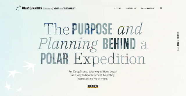
Design Process
Team Structure
Direct Agency Team
Principal UX Designer (Content Design Lead)Senior Visual Designer (Creative Direction) ✦
Senior Project Manager (Client Management)
Visual Designers x2 (Imagery & Social Content)
Collaborative Partners
Internal client working team (marketing, brand, social, content strategy, business leads & execs).Internal design & development team.
Third party platform teams (Contently & Ceros) for content marketing & interactive website tools.
Discovery
Extensive market research and competitor benchmarking was completed before 2 days of in person workshops at the Bank of the West HQ in San Francisco.
I joined our Principal UX Designer (agency director with specialism in content design) and our senior Project Manager leading the workshops with the large internal working team. The team had extensive data on their existing customers who we learned were diverse and discerning. We worked out our project structure and hierarchy based on their respective paths through the new marketing funnel we were building.
UX Design
The experience design flow was anchored in a content first approach that prioritised keeping people engaged long enough to learn more about the bank and take their first steps in the newly structured content marketing funnel. Our approach to direct product advertising was intentional and respectful to ensure a seamless transition from reader to customer.
Results
Within 6 months of launching the publication we achieved a 66% reduction in customer churn with 30% returning visitors with average reading times 54% above the industry standard at the time.My Focus
Visual Identity Development
Branding Challenge
Bank of the West had inherited its’s brand design from their parent company BNP Paribas. This new project needed a distinct visual language while also remaining connected to the parent company.
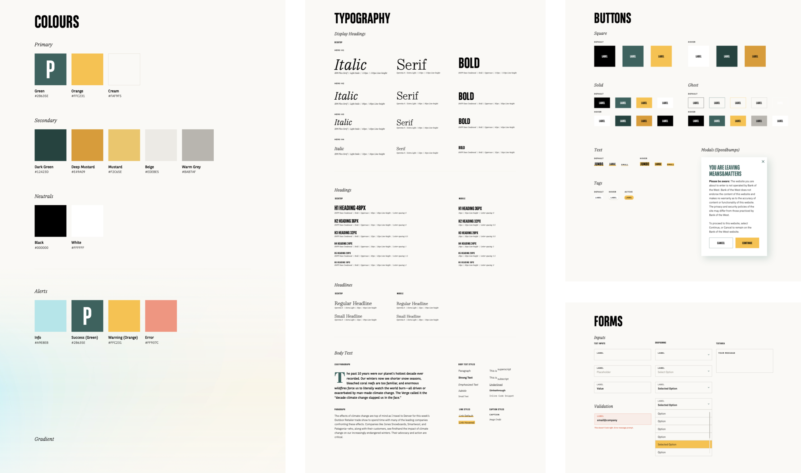
I had previously worked in-house on digital design system for BNP Paribas so had a good awareness of their existing system. I built a distinguished visual identity for Means&Matters starting with 2 secondary colours in the Bank of the West and BNP Paribas brand guidelines.
I worked with a Graphic Designer on the team to develop a set of image treatments that could be applied to all image assets. These provided a stronger visual identifier for the project and brand, gave flexibility when working with lower resolution imagery and helped created a unified visual identity across the platform.
What I Delivered
Logo Mark Design
Digital Brand Guidelines
Full UI design system
Responsive Website Designs
Interaction Design Prototypes
Social & Marketing Templates
Bespoke Image Treatments
Ongoing Creative Support
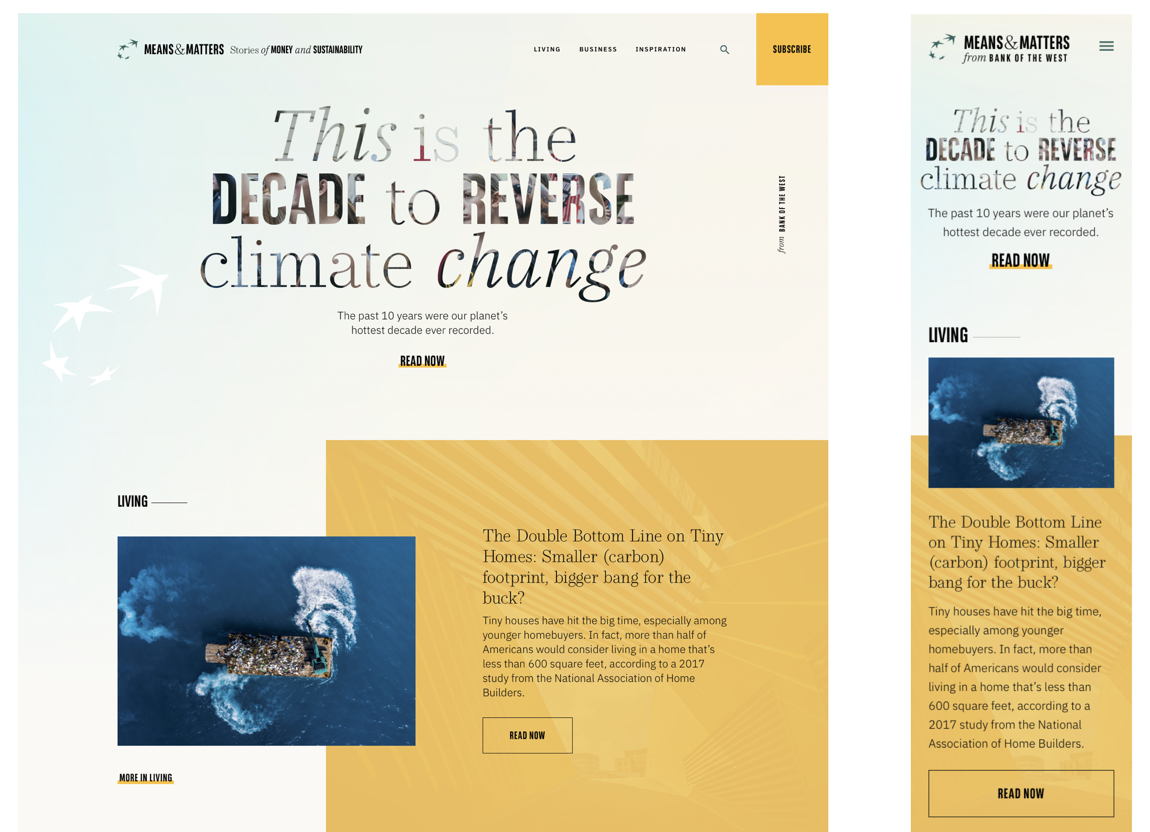
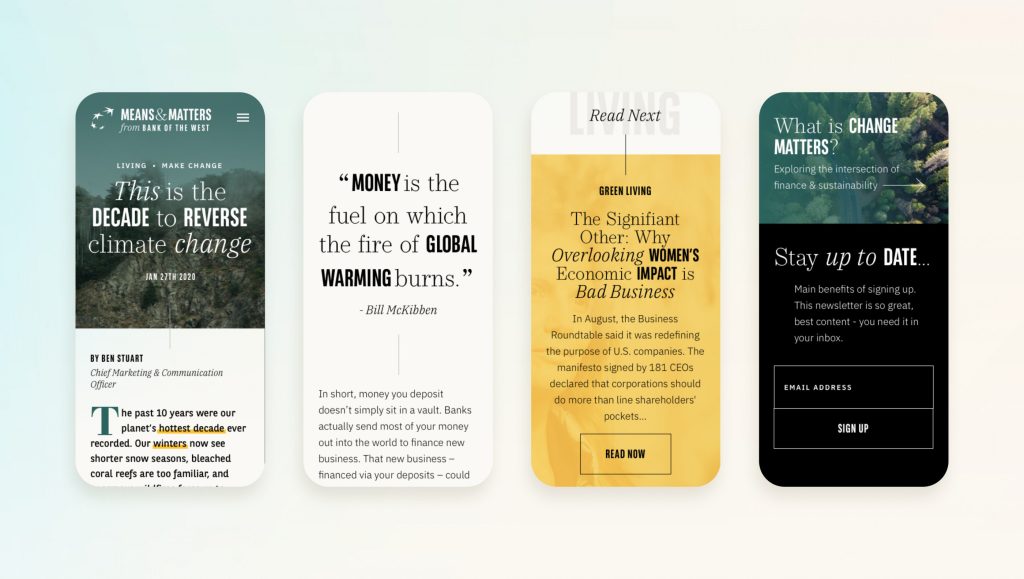
Responsive by default.
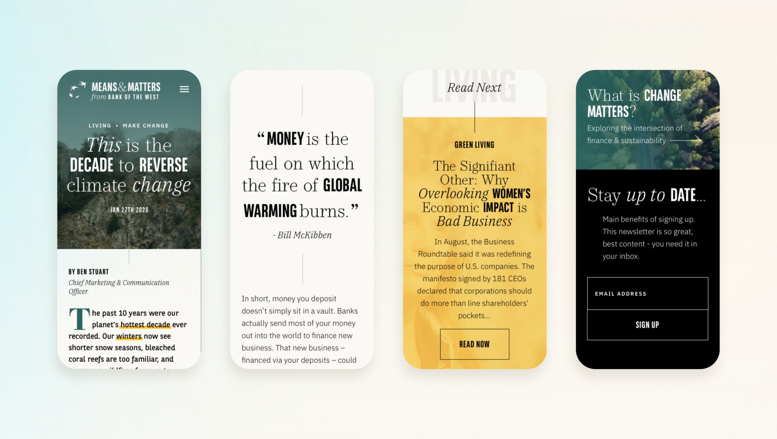
Excellent reading experiences on all devices.
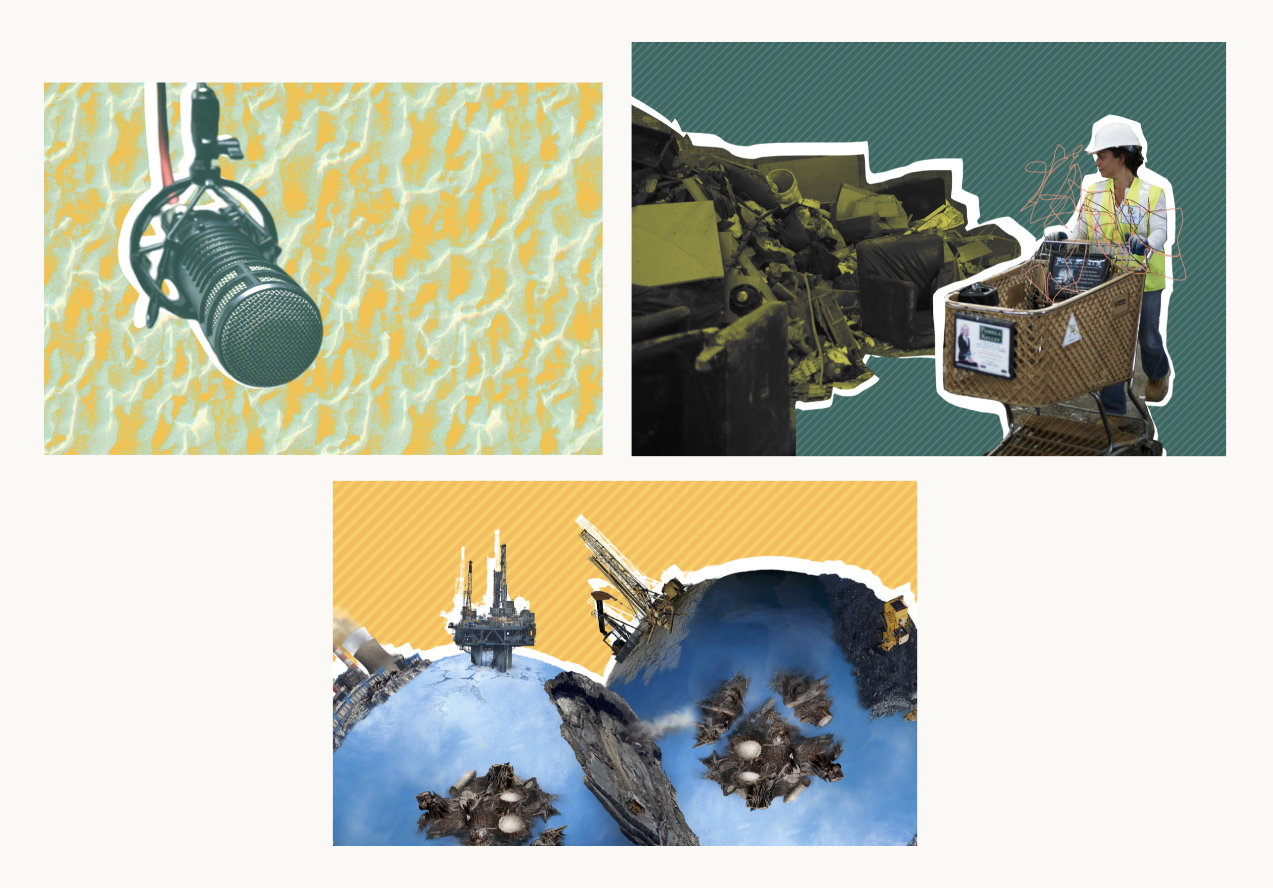
Bespoke image treatments inspired by printed DIY zine culture.
Reading Experience
Typography
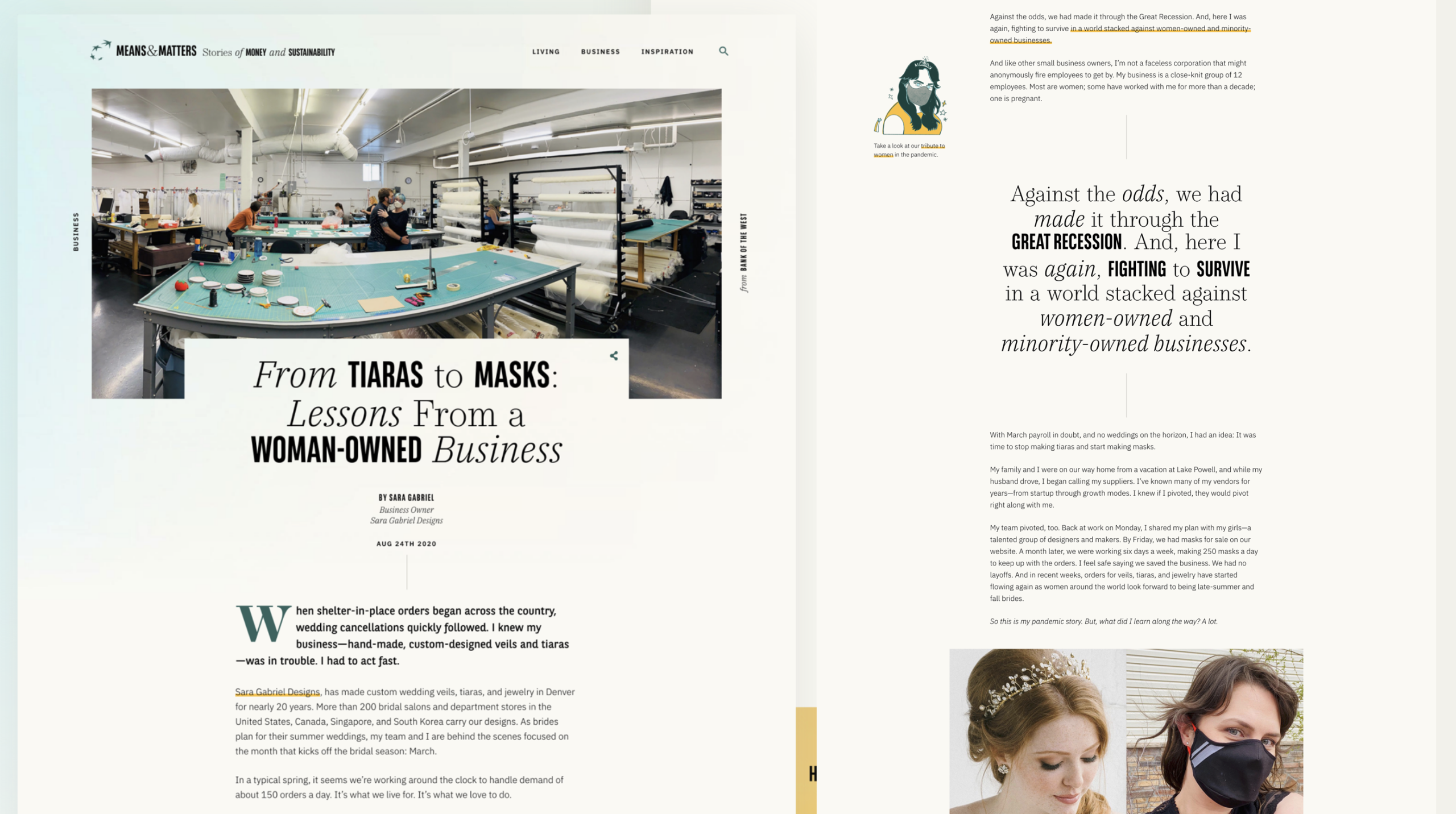
The typographic system was central to the overall visual identity of this project. As a reading platform I took inspiration from printed media – newspapers, zines etc to build reading experiences that felt elevated and distinguished. I knew there would be imagery constraints so the type became a visual element that demanded attention by itself.
I developed a mixed type treatment that would work as a visually interesting heading treatment and supported our goal of creating a distinguished look and feel for the overall publication.
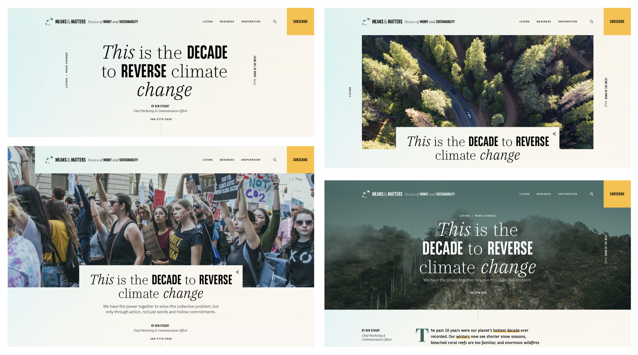
Flexibility & variety in article headers.
Summary
Ultimately we created a highly successful platform that outperformed expectations on both business objectives and consumer awareness & attitudes. This work resulted in a multi-year relationship with Bank of the West that expanded into multiple other design projects and ongoing visual design support. I hired a new graphic designer for production support and managed the majority of the client relationship post-launch. During this time I provided creative oversight on all creative project work led by my agency as well as other internal and external teams.
This case study is a work in progress but you can contact me if you’d like more details.